I asked the AI for a revenue dashboard
I typed eleven sentences into the widget builder of the analytics platform I am building, on a demo tenant with synthetic data. The result is an executive revenue dashboard: four KPIs, a revenue mix, an earned-versus-sold trend, a category rank chart, a location ramp, a provider ranking, a three-level drill table, and the membership base. The film below is the uncut take, from a blank page to the finished dashboard.
What one sentence turns into
The prompt box is not a SQL generator. A sentence becomes a small specification: which metrics, which breakdowns, which filters, which time window. That specification is validated against a governed catalog before anything runs. A hallucinated metric cannot execute, because it does not exist to execute. A deterministic engine compiles the specification to SQL, runs it, and the preview in the drawer is the exact result that will land on the dashboard.
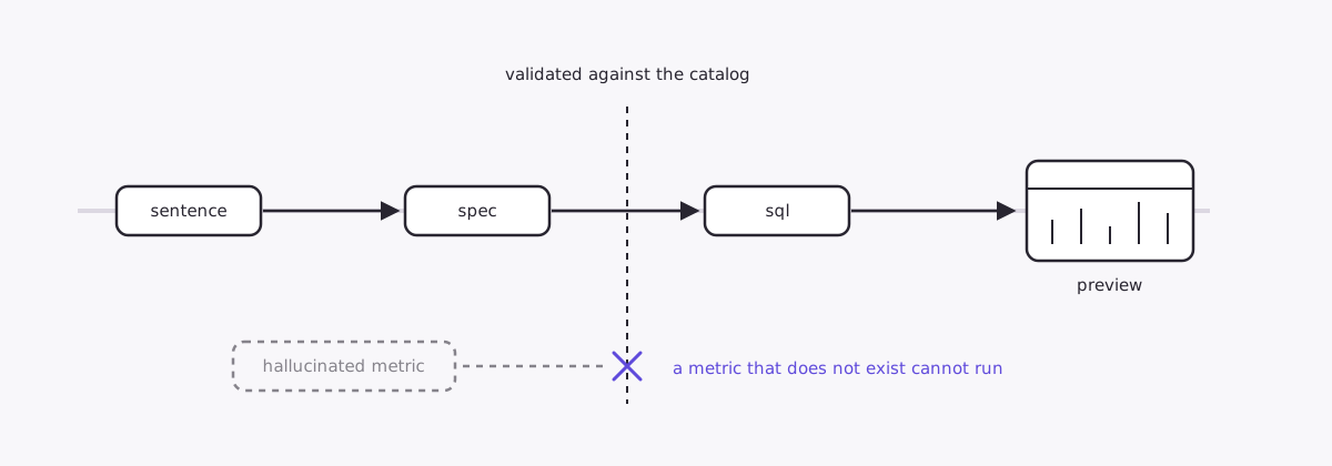
Here is what the seventh sentence, “monthly net sales by service category over the last 12 months, services only”, actually produced:
{
  "metrics": ["net_sales"],
  "group_by": "sale_month",
  "group_by2": "service_category",
  "filters": [
    { "dimension": "item_type", "op": "in", "values": ["Service"] }
  ],
  "date_preset": "last_12_months"
}
The trailing “services only” became a real filter, and the drawer narrates it back in words: limited to Item Type Service. The chart itself is chosen by the shape of the result, not by the model. Two dimensions where one is time reads best as a mix over time, so it suggested a stacked area; one click flipped it to a bump chart, which shows category rank changing month to month. Every widget also keeps its prompt. Open any card on the finished dashboard and the sentence that built it is right there, so the whole dashboard can be re-created by reading it.
The catalog did not come from introspecting a schema. It comes from more than two years of living inside this data: reconciling the source system’s reports against its APIs, learning which grain each number lives at, what an invoice line is versus a payment versus a redemption, which timestamps are the calendar and which are the stopwatch. The specification language can stay small because the semantics under it were earned a grain at a time, checked against what the source system actually returns.
The eleven sentences
- Total net sales this month
- Total guests this month
- Average ticket this month
- Total invoices this month
- Share of net sales by item type last 12 months
- Monthly revenue vs net sales for the last 12 months
- Monthly net sales by service category over the last 12 months, services only
- Guests by location by month last 12 months
- Rank our top 10 providers by net sales over the last 90 days
- Net sales by location, service category and sub-category for the last 6 months
- Active members by month for the last 12 months
The first four land as KPI tiles with comparisons that name their dates: Aug 1 to Aug 18, 2026 against Jul 1 to Jul 18, 2026, the same days of the prior month, not a vague “vs last month”. The rest land as the chart the data calls for.
One it satisfied, one it narrowed, one it refused
The tenth sentence asks for three breakdown levels at once. No chart can read three axes, and the platform knows that, so instead of drawing something misleading it produced a table with expandable rows: locations collapsed with their share of the total, one click opens the categories inside a location, another opens the sub-categories. The total row reconciles to the cent with the rest of the dashboard.
Then I asked for “net sales by sub-category this quarter compared to the previous quarter”. The builder did not draw anything. It asked me a question: this tenant has only one classification level, so which breakdown did I mean? On this demo tenant that is simply true, and a clarifying question is the correct answer.
A wrong chart that renders is worse than a question.
And I asked for “average ticket by location this year vs last year”. The builder refused the request outright and offered to hand it to the assistant instead. Comparisons across two windows belong to the dashboard’s period selector, which every widget follows, not to a single widget quietly running two queries. The refusal is a design position: when the governed path cannot express a request faithfully, it says so, loudly, rather than producing a nearest fit that drops a requirement.
The parts that keep it honest
Two details in the finished dashboard are the reason I trust this way of working.
First, the drill table shows a bucket called “No service category” holding $310,128.00 for one location over six months. That is membership, package, retail and gift card money, real revenue that has no service category to belong to. The easy thing would be to hide it and show a cleaner table that quietly disagrees with the dashboard total. It is labeled instead, and the totals match.
Second, sentence six asks for revenue and net sales on the same chart, and the two lines do not match, on purpose. In July 2026 the demo business sold $283,344.37 and earned $241,914.60, because packages and memberships are sold now and earned as they are used. Most tools present these as the same number. Keeping them apart, on one chart an operator can read, is most of what “trustworthy” means to me.
Status
This is a project I am building, not a product launch. Everything above runs on a demo tenant whose data comes from a simulator, which is what makes it safe to film and publish. Demo data only; no customer numbers appear anywhere on this site. The numbers still have to reconcile: the engine’s figures are checked against the same warehouse the dashboards read. The earlier essays here are being reworked and will come back one at a time.